

Introduction to geospatial analysis
After looking at map visualization projects regarding COVID-19 spread, I fell down a rabbit hole of intuitive maps visualizing things from pollution to endemic species. I soon realized that Python is a great tool to visualize locations and location-based data elegantly. It can broaden the insights we take from data.
There are many packages for static mapping including GeoPandas, Basemap, and Plotly. I decided to start simple and work with the geo mapping package, Basemap. Basemap has in-built functionality to create maps of the US and also has the capability to work with shapefiles or shp files. For this project, I decided to test out the in-built USA map and the functions present in Basemap.
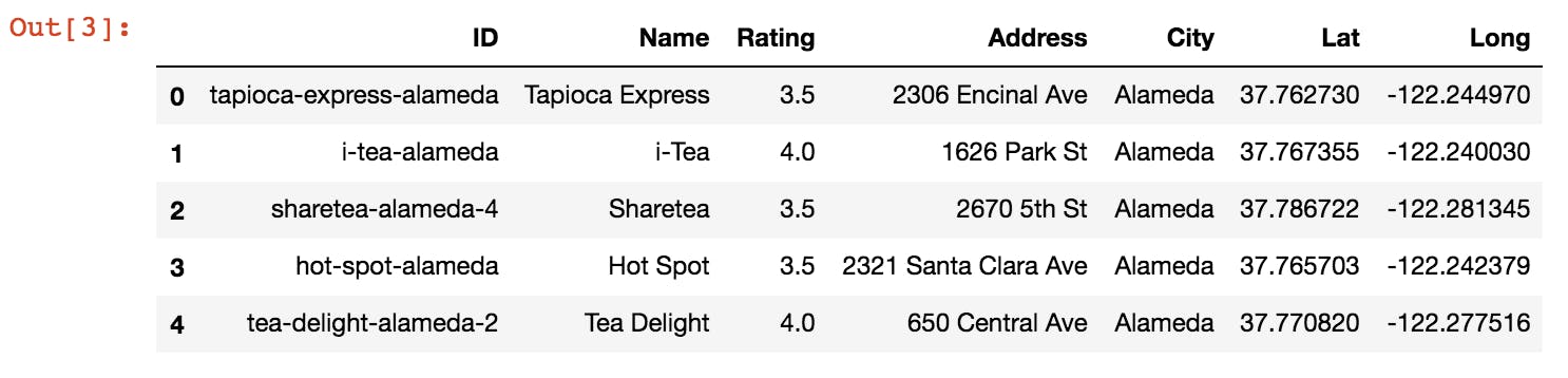
Now that I knew the package I was working under, I had to figure out what to plot. I love drinking boba and any reason to analyze boba stores sounds great to me. I decided to use this dataset which listed the locations of boba stores only in the SF Bay Area. The column values include their ratings, names, and street locations all in coordinate format which is perfect for geo mapping beginners.
Making the static map
First, I imported packages into my Jupyter Notebook. I needed Basemap, Pandas, and Matplotlib to modify the plot.
I imported the boba data and went ahead and cleaned up the dataframe. I dropped the unwanted columns and renamed some of the remaining. I dropped the NaN values and sorted the dataframe according to the City name.
import pandas as pd
from shapely.geometry import Point
import matplotlib.pyplot as plt
from mpl_toolkits.basemap import Basemap

boba_spots = pd.read_csv("../bobaMapping/bayarea_boba_spots.csv")
boba_spots = boba_spots.drop(columns = "Unnamed: 0", axis = 1)

boba_spots = boba_spots.rename(columns = {"id" : "ID", "name" : "Name", "rating" : "Rating", "address" : "Address",
                                          "city" : "City", "lat" : "Lat", "long" : "Long"})

boba_spots = boba_spots.dropna(axis = 0, how = "any")

boba_spots = boba_spots.sort_values(by = ["City"])
boba_spots = boba_spots.reset_index().drop(columns = "index")
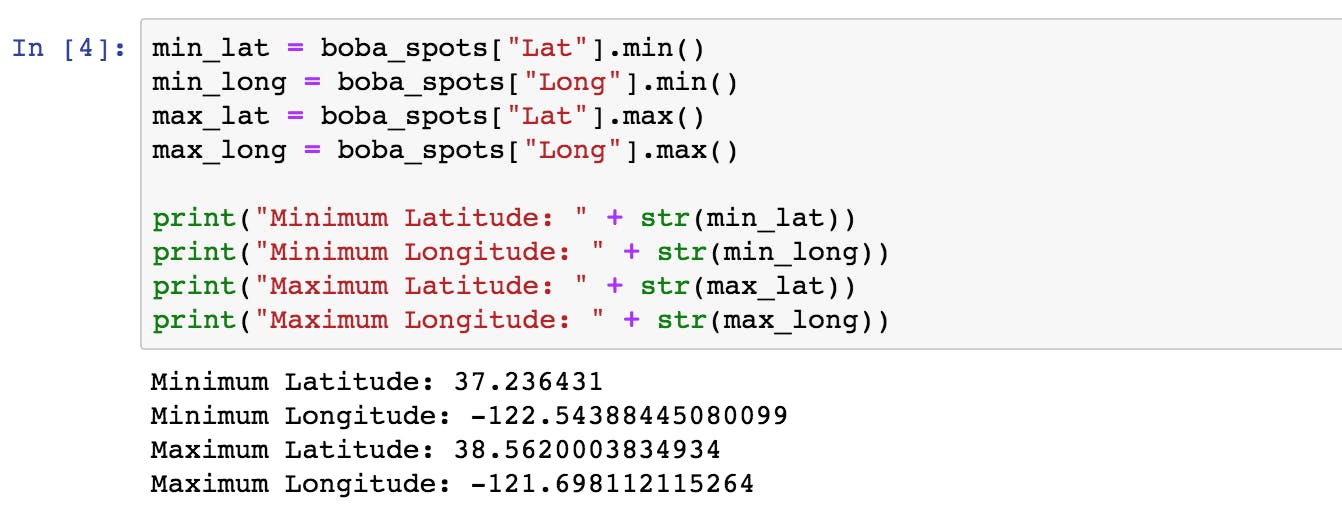
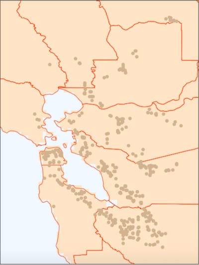
We first need to find the maximum and minimum bounds of the locations of the stores from the data provided. This helps us zoom into the SF Bay Area from the overall US map.
After getting the maximum and minimum lat/long data, we use the drawlsmask() and drawcounties() functions to get an accurate SF Bay Area base map.
- drawlsmask(): This colors the land and the sea of the map differently.
- drawcounties(): This creates the county boundaries on the base map.
figure = plt.figure(1, (10, 10))
SF_map = Basemap(min_long, min_lat, max_long, max_lat, "ortho", "c")

SF_map.drawlsmask(land_color = "bisque", ocean_color = "aliceblue", lakes = False, resolution = "h")
SF_map.drawcounties(linewidth = 1, color = "orangered")

plt.show()
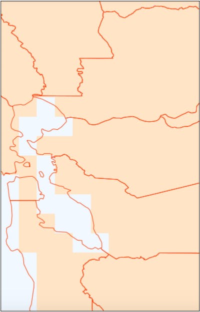
From the above map, we can tell that there is a step like pattern. The misaligned step-like pattern on the coastline emerges due to the pixel size of the ocean color. To eliminate the steps, we can alter the size of the grid and put it at its minimum of 1.25 minutes denoted by 1.25. We also increase the resolution to "full" denoted by f.
Along with borders for the overall map dimensions, I plotted the coordinates of each of the boba stores.
figure = plt.figure(1, (10, 10))
SF_map = Basemap(min_long - 0.2, min_lat - 0.1, max_long + 0.1, max_lat + 0.1, "mill", "c")

SF_map.drawlsmask(land_color = "bisque", ocean_color = "aliceblue", lsmask = 1, lakes = False, resolution = "f",
                  grid = 1.25)
SF_map.drawcounties(linewidth = 1, color = "orangered")

#Plots the coordinates
lats = boba_spots["Lat"]
long = boba_spots["Long"]

x, y = SF_map(long, lats)

SF_map.scatter(x, y, color = "tan")

plt.show()
I also annotated each of the counties - to make the map easier to understand.
figure = plt.figure(1, (10, 10))
SF_map = Basemap(min_long - 0.04, min_lat - 0.03, max_long + 0.03, max_lat + 0.03, "mill", "c")

SF_map.drawlsmask(land_color = "bisque", ocean_color = "aliceblue", lsmask = 1, lakes = False, resolution = "f", grid = 1.25)
SF_map.drawcounties(linewidth = 1, color = "orangered")

#Plots the coordinates
lats = boba_spots["Lat"]
long = boba_spots["Long"]

x, y = SF_map(long, lats)

SF_map.scatter(x, y, color = "tan")

a, b = SF_map(-122, 38.55)
plt.text(a, b, "Yolo", fontsize = 11.5, ha = "left", va = "center", color = "black")

a, b = SF_map(-122, 38.2)
plt.text(a, b, "Solano", fontsize = 11.5, ha = "left", va = "center", color = "black")

#I repeated this on the rest of the counties
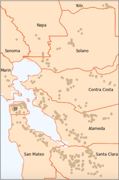
Looks like we're done!
My takeaways about Basemap
- Built in plotting of counties within California and the other states within the US is made very easy.
- The definition of the coastline is great even after magnifying a section of the US map.
- There is a wide range of color choices within the map.
- We have to find the minimum and maximum latitudes and shift the map to get the right area.
- The slight brick-like pattern remained even in high res - if anyone knows how to fix this, it would be much appreciated!
Article Cover: Photo by Tatiana Rodriguez on Unsplash